How to create call to action (CTA) buttons on your website home page
NOTE: Your layout must support CTAs before implementing them. If you are unsure whether or not it does, contact your Client Account Partner.
Step 1. From the Dashboard menu, navigate to the home page and select Edit Page
Step 2. Scroll down to the section of the page editor titled Page Widgets.
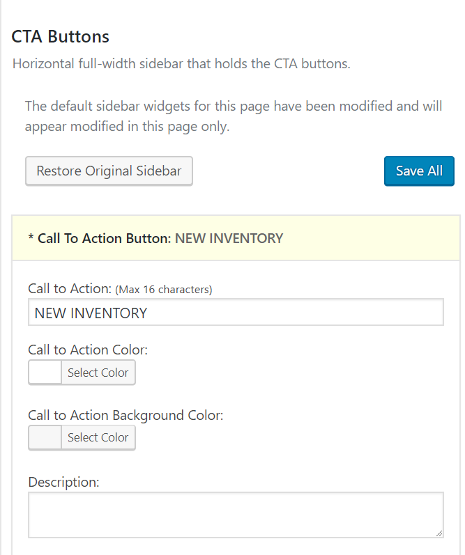
Step 3. Drag the option titled Call To Action Button into the field on the right labeled CTA Buttons. Tfield should now expand and provide options for each CTA including title, description, color or image, and link URL.
Step 4. Create the desired CTA and click Save.
Step 5. Click Update.
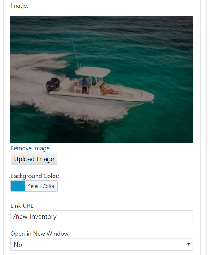
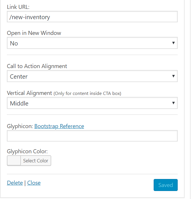
Below, is an example of all the areas that you can customize such as title, color, background image (optional), link URL and alignment.


This CTA, in particular, will look like this:

Best Practices:
Size: A bigger CTA button or banner will stand out more, but don't go overboard. Having too large of a CTA can risk getting lost due to banner blindness.
Color: Generally speaking, green and orange buttons are reported to perform best. Ultimately it will depend on your site design, as contrasting colors work best to make striking buttons that stand out. You wouldn’t want a green CTA button on a green background.
Contrast: An easy rule-of-thumb to make your CTA stand out is to create contrast with the surrounding content. Vibrant colors are great for creating contrast and drawing attention. When you're deciding on which color to use, a good way to start is by looking at the most common colors used on your website or landing page design and pick the opposite to create contrast.
Image: If you use an image or custom design in your CTA, it should always be high-quality and relevant to the offer. Consider featuring an image of what you're offering or perhaps an image of someone enjoying it